The generated application can be customized by checking or unchecking various properties.
Modify the report printing options
If your form has a valid relation on the BA diagram to a Report entity, additional actions are generated for the Toolbar and TopMenu to launch the report. The Report Option properties are used to define which report actions should be generated.
Figure 1. Report Options properties
| Property | Description |
|---|---|
| quickPrint | Defines if print action is available. |
| quickPreview | Defines if preview action is available. |
| quickPDF | Defines if export to PDF action is available. |
| quickHTML | Defines if export to HTML action is available. |
| quickXLS | Defines if export to XLS action is available. |
| quickRTF | Defines if export to RTF action is available. |
| canExport | Defines if the PDF, HTML, XLS, and/or RTF print actions are available. If canExport is checked and quickPDF, quickHTML, quickXLS, or quickRTF are also checked, the action will be available. |
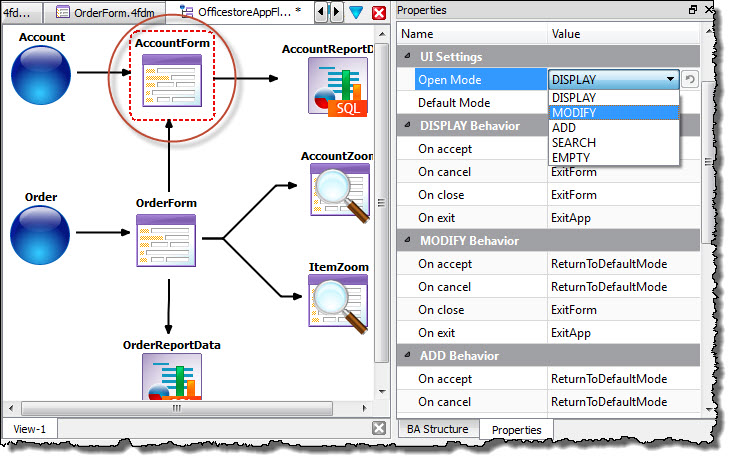
Set the initial form state with the Open Mode property

Figure 2. Setting the form state
| Property | Usage | Options |
|---|---|---|
| Open Mode Default Mode | Open mode is the initial state of the form when opened. The rendered form's default toolbar allows the user to switch modes. Default mode is the mode in which you return after leaving another mode. |
|
| DISPLAY Behavior
MODIFY Behavior
ADD
Behavior
SEARCH Behavior Note: Zoom
forms have properties for only DISPLAY Behavior and SEARCH
Behavior.
|
Specify how the form should behave in each form state.
On accept On cancel On close On exit |
|
Set the functionality to be generated with the record Functionality properties
The program and user interface logic is generated when functionality properties are set. The state of the action (enabled/disabled) or the availability of the action in the toolbar/topMenu depends on the setting of the Functionality properties. For example, if the canSearch property is checked, the form will allow for data queries and the toolbar and topmenu will include a button and menu option for searching.
- canAdd
- The form can be used to add data in this record.
- canModify
- The form can be used to modify data in this record.
- canDelete
- The form can be used to delete data in this record.
- canSearch
- The form can be used to search data in this record. canSearch is the only functionality property available to Zoom forms.

Figure 3. Setting the record Functionality properties