Summary:
See also: Form Attributes, Database Schema, Localized Strings, Windows and Forms, Dynamic User Interface.
A Form Specification File is a source file defining an application screen. This file defines the disposition, presentation and behavior of screen elements called "Form Items".
filename.per
To write a form specification file, you need to understand the following concepts:
A form file is described with a specific structure, based on a layout definition using containers which hold form items.
A form specification file is defined by a set of sections; if present, the section must appear in the order listed below:
Each form specification file can begin with a SCHEMA section identifying the database schema (if any) on which the form is based. This can be any database schema that is defined with a database schema file. Form field data types can be automatically selected from the schema file if you specify the table and column name in the form field definition (see ATTRIBUTES section).
SCHEMA {  database[@dbserver]
| string | FORMONLY }
DATABASE {  database[@dbserver]
| string | FORMONLY } [ WITHOUT NULL INPUT ]
The DATABASE syntax is supported for compatibility with Informix 4gl; using SCHEMA is recommended.
The ACTION DEFAULTS section defines local action view default attributes for the form elements.
ACTION DEFAULTS

  ACTION action-identifier ( action-attribute [,...] )


 [...]

END
Notes:
The ACTION DEFAULTS section is provided to centralize action view attributes (text, comment, image, accelerators) at the form level.
A list of ACTION elements specifies the attributes for each action. The action is identified by the name following the ACTION keyword, and attributes are specified in a list enclosed in parenthesis.
The attributes defined in this section will be applied to form action views like Buttons, Toolbar buttons or Topmenu options, if these action views do not explicitly define the attribute. If the attribute is not found in the form action defaults, the runtime system searches in the global action defaults.
See Action Defaults for more details.
01ACTION DEFAULTS02ACTION accept ( COMMENT="Commit order record changes" )03ACTION cancel ( TEXT="Stop", IMAGE="stop", ACCELERATOR=SHIFT-F2 )04ACTION print ( COMMENT="Print order information", ACCELERATOR=CONTROL-P )05ACTION zoom1 ( COMMENT="Open items list" )06ACTION zoom2 ( COMMENT="Open customers list" )07END
The TOPMENU section defines a pull-down menu with options that are bound to actions.
TOPMENU [menu-identifier] ( menu-attribute [,...] )
  group


 [...]

END
where group is:
GROUP group-identifier ( group-attribute [,...] )

  { command

  | group

  |  separator

  }
 [...]

END
where command is:
COMMAND command-identifier (
command-attribute [,...] )
and separator is:
SEPARATOR [separator-identifier] ( separator-attribute [,...] )
Notes:
The TOPMENU section is provided to define a pull-down menu in a form. You build a tree of GROUP elements to design the pull-down menu. A GROUP can contain COMMAND, SEPARATOR or GROUP children. A COMMAND defines a pull-down menu option that triggers an action when it is selected. In the Topmenu specification, command-identifier defines which action the menu options must be bound to. For example, if you define a Topmenu option as "COMMAND zoom", it can be controlled by an "ON ACTION zoom" clause in an interactive instruction.
The Topmenu commands are enabled according to the actions defined by the current interactive instruction, which can be MENU, INPUT, INPUT ARRAY, DISPLAY ARRAY or CONSTRUCT. See also Interaction Model for more details about action management. You can use the Predefined Actions to bind Topmenu commands to common actions such as dialog validation and cancellation.
01TOPMENU myTopMenu02GROUP form (TEXT="Form")03COMMAND help (TEXT="Help", IMAGE="quest")04COMMAND quit (TEXT="Quit")05END06GROUP edit (TEXT="Edit")07COMMAND accept (TEXT="Validate", IMAGE="ok", TAG="acceptMenu")08COMMAND cancel (TEXT="Cancel", IMAGE="cancel")09SEPARATOR10COMMAND editcut -- Gets its decoration from action defaults11COMMAND editcopy -- Gets its decoration from action defaults12COMMAND editpaste -- Gets its decoration from action defaults13END14GROUP records (TEXT="Records")15COMMAND append (TEXT="Add", IMAGE="plus")16COMMAND delete (TEXT="Remove", IMAGE="minus")17COMMAND update (TEXT="Modify", IMAGE="accept")18SEPARATOR (TAG="lastSeparator")19COMMAND search (TEXT="Search", IMAGE="find")20END21END
The TOOLBAR section defines a toolbar with buttons that are bound to actions.
TOOLBAR [toolbar-identifier]  [ ( toolbar-attribute [,...] )
]

  { ITEM item-identifier  [ ( item-attribute [,...] )
]

  | SEPARATOR [separator-identifier] [ (
separator-attribute [,...] )
]
}
[...]
END
The TOOLBAR section is provided to define a typical toolbar in a form. A TOOLBAR section defines a set of ITEM elements that can be grouped by using a SEPARATOR element. Each ITEM defines a toolbar button associated to an action by name. The SEPARATOR keyword specifies a vertical line.
The Toolbar buttons are enabled according to the actions defined by the current interactive instruction, which can be MENU, INPUT, INPUT ARRAY, DISPLAY ARRAY or CONSTRUCT. See also Interaction Model for more details about action management. You can use the Predefined Actions to bind toolbar buttons to common actions such as dialog validation and cancellation.
The TOOLBAR supports the BUTTONTEXTHIDDEN attribute to hide the labels of buttons. By default the button labels are visible.
01TOOLBAR02ITEM accept ( TEXT="Ok", IMAGE="ok" )03ITEM cancel ( TEXT="Cancel", IMAGE="cancel" )04SEPARATOR05ITEM editcut -- Gets its decoration from action defaults06ITEM editcopy -- Gets its decoration from action defaults07ITEM editpaste -- Gets its decoration from action defaults08SEPARATOR ( TAG="lastSeparator")09ITEM append ( TEXT="Append", IMAGE="add" )10ITEM update ( TEXT="Update", IMAGE="modify" )11ITEM delete ( TEXT="Delete", IMAGE="del" )12ITEM search ( TEXT="Search", IMAGE="find" )13END
The LAYOUT section defines the graphical alignment of the form by using a tree of layout containers.
LAYOUT  [(attribute[=value][,...])]

  root-layout-container

 [END]
root-layout-container is the first container that holds other containers.
TEXT, TAG, STYLE, VERSION, SPACING, WINDOWSTYLE.
You define the layout tree of the form by associating layout containers. Different kind of layout containers are provided, each of them having a specific role. Some containers can hold children containers and others can define a screen area. Containers using a screen area define a formatted region containing static text labels, item tags and layout tags. The END keyword is mandatory to define the end of a container block.
LAYOUT

  VBOX

    GRID

      grid-area

    END

    GROUP

      HBOX

        GRID

          grid-area

        END

        TABLE

          table-area

        END

      END

    END

  END

END
The above definition would result in a layout tree that looks like this:
-- VBOX

   |

   +-- GRID 1

   |

   +-- GROUP

       |

       +-- HBOX

           |

           +-- GRID 2

           |

           +-- TABLE 1
but, the layout section can also contain a simple GRID container (this would be equivalent to a V3 SCREEN definition):
LAYOUT

  GRID

    grid-area

  END

END
The VERSION attribute can be used to specify a version for the form. This allows you to indicate that the form content has changed; typically used to avoid the front-end reloading the saved window settings.
The TEXT attribute can be used to define the title of the window that will display the form. This attribute will automatically be applied to the parent window when a form is loaded. See Windows and Forms for more details.
The STYLE attribute defines the decoration style for form elements; you can, for example, define a font property for all form elements.
With the WINDOWSTYLE attribute, you can define the window type and decoration. This attribute will automatically be applied to the parent window when a form is loaded. See Windows and Forms for more details. For backward compatibility, the STYLE attribute is used as the default WINDOWSTYLE if this attribute is not used.
01 LAYOUT ( TEXT="Customers", WINDOWSTYLE="dialog", VERSION="1.20" )To support existing V3 form files, you can define a SCREEN section in place of LAYOUT.
SCREEN  [ size lines  [ by chars
 ]  ]  [  title "title"  ]

{

  { text | [ item-tag [ | item-tag
] [...] ] }

  [...]

}

 [END]
{} curly braces are used to delimit the body of the
screen.Inside the SCREEN section, you can define the position of text labels and form fields.
01SCREEN02{03CustId : [f001 ] Name: [f002 ]04Address : [f003 ]05[f003 ]06}07END
Layout Containers are blocks holding other layout containers or defining a formatted screen region.
container-type  [identifier] [(attribute[=value][,...])]

  child-container

  [...]

END
where child-container can be:
{

  VBOX [identifier] [(attribute[=value][,...])]

    child-container

    [...]

  END

|

  HBOX [identifier] [(attribute[=value][,...])]

    child-container

    [...]

  END

|

  GROUP [identifier] [(attribute[=value][,...])]

    child-container

    [...]

  END

|

  FOLDER [identifier] [(attribute[=value][,...])]

    PAGE [identifier] [(attribute[=value][,...])]

      child-container

      [...]

    END

    [...]

  END

|

  GRID [identifier] [(attribute[=value][,...])]

  {

   grid-area

  }

  END

|

  SCROLLGRID [identifier] [(attribute[=value][,...])]

  {

   scroll-area

  }

  END

|

  TABLE [identifier] [(attribute[=value][,...])]

  {

   table-area

  }

  END

}
Different types of layout containers are provided, each of them having a specific use:
| Name | Can Hold | Description |
| VBOX | VBOX, HBOX, GROUP, FOLDER, GRID, SCROLLGRID, TABLE | Packs contained elements vertically, without any decoration. |
| HBOX | VBOX, HBOX, GROUP, FOLDER, GRID, SCROLLGRID, TABLE | Packs contained elements horizontally, without any decoration. |
| GROUP | VBOX, HBOX, GROUP, FOLDER, GRID, SCROLLGRID, TABLE | Decorates the contained element with a rounded box that has a title. |
| FOLDER | PAGE | Presents contained pages in a folder tab. Can only contain PAGE children! |
| PAGE | VBOX, HBOX, GROUP, FOLDER, GRID, SCROLLGRID, TABLE | Defines a page of a FOLDER container. Can only be used in FOLDER! |
| GRID | grid-area | Unique-record presentation with positioned fields and labels. |
| SCROLLGRID | scroll-area | Multiple-record presentation with positioned fields and labels. |
| TABLE | table-area | Record-list presentation with columns and rows. |
In most cases you do not need to give a name to a container, because it is only used in the form file to define the layout. However, if you want to change some attributes at runtime, you must identify the container. You can give a name to the container by writing an identifier after the container type, for example:
01 GROUP group1 (TEXT="Customer")In this example, the group name is 'group1', and it can be
used in a program to identify the element:
01DEFINE w ui.Window02DEFINE g om.DomNode03LET w = ui.Window.getCurrent()04LET g = w.findNode("Group","group1")05CALL g.setAttribute("text","This is the first group")
In the next example, the program hides a field identified by 'customer.custid':
01DEFINE w ui.Window02DEFINE f ui.Form03LET w = ui.Window.getCurrent()04LET f = w.getForm()05CALL f.setElementHidden("customer.custid",1)
The HBOX container automatically packs the contained elements horizontally from left to right. Contained elements are packed in the order in which they appear in the LAYOUT section of the form file. No decoration is added when using such a container. By combining VBOX and HBOX packers you can define any alignment you choose.
HBOX   [identifier]  [(attribute[=value][,...])]


  layout-container

  [...]


END
01HBOX02GROUP ( TEXT = "Customer" )03{04...05}06END07TABLE08{09...10}11END12END
The VBOX container automatically packs the contained elements vertically from top to bottom. Contained elements are packed in the order in which they appear in the LAYOUT section of the form file. No decoration is added when you use this container. By combining VBOX and HBOX packers you can define any alignment you choose.
VBOX [identifier]  [ (attribute[=value][,...])]


  layout-container

  [...]


END
01VBOX02GROUP ( TEXT = "Customer" )03{04...05}06END07TABLE08{09...10}11END12END
A GROUP container can be used to display a titled box (usually called groupbox) around contained elements. To display a groupbox widget around a set of fields, you simply put a GROUP declaration around a GRID definition. If you want to include several children in a GROUP, you can add a VBOX or HBOX into the GROUP, to define how these elements are aligned.
GROUP [identifier] [(attribute[=value][,...])]


  layout-container

  [...]


END
STYLE, TAG, HIDDEN. FONTPITCH, TEXT.
01GROUP ( TEXT = "Customer" )02VBOX03GRID04{05...06}07END08TABLE09{10...11}12END13END14END
A FOLDER container can be used to display children inside a "folder tab" widget. You must define each folder page with a PAGE container inside the FOLDER container. Each PAGE container will be displayed on a separate folder page, accessed by TAB CONTROL click. If you want to include several containers in one page of a FOLDER, you can add a VBOX or an HBOX container to define how these elements are aligned.
FOLDER [identifier] [(attribute[=value][,...])]

  page-definition

  [...]

END
STYLE, TAG, HIDDEN, FONTPITCH.
In the above syntax, the page-definition defines one page of the folder. See PAGE container for more details.
A PAGE container can only be a child of a FOLDER container. A PAGE container is defined as follows:
PAGE [identifier] [(attribute[=value][,...])]

  layout-container

  [...]

END
ACTION, STYLE, TAG, HIDDEN, FONTPITCH, IMAGE, TEXT.
By default PAGE containers are used to group elements for decoration only. With the TABINDEX form field attribute, you can define which field gets the focus when a folder page is selected.
The TEXT attributes defines the label of the folder page and the IMAGE attribute allows you to use an icon.
If needed, you can use the ACTION attribute to bind an action to a folder page. When the page is selected, the program gets the corresponding action event.
01FOLDER02PAGE p1 ( TEXT="Global info" )03GRID04{05...06}07END08END09PAGE p2 ( IMAGE="list" )10TABLE11{12...13}14END15END16END
The GRID container declares a formatted text block defining the dimensions and the positions of the logical elements of a screen for a unique-record presentation. With GRID, you can specify the position of labels, form fields for data entry or additional interactive objects such as buttons. You design the layout of a GRID by using static text, item tags, hbox tags and layout tags.
GRID [identifier] [(attribute[=value][,...] )]

{

  { text

  | item-tag

  |   hbox-tag

  | layout-tag

  | h-line
}

  [...]

}

END
STYLE, TAG, HIDDEN, FONTPITCH.
A GRID container defines a layout area based on character cells. It is used to place form items such as labels, fields or buttons at a specific position. Form items are located with item tags in the grid layout area. You can use layout tags to place some type of containers inside a grid.
Simple GRID example defining 3 labels and 3 fields:
01GRID02{03Id: [f1] Name: [f2 ]04Addr: [f3 ]05}06END
The SCROLLGRID container declares a formatted text block defining the dimensions and the position of the logical elements of a screen for a multi-record presentation. This container is similar to the GRID container, except that you can repeat the screen elements on several "row-templates", in order to design a multiple-record view that will appear with a vertical scrollbar.
SCROLLGRID [identifier] [(attribute[=value][,...])]

{

  row-template

   [...]

}

END
where row-template is a text block containing:
{ text

 | item-tag

 | h-line
}

[...]
STYLE, TAG, HIDDEN, FONTPITCH.
The same layout rules apply as in a GRID container.
01SCROLLGRID02{03Id: [f001 ] Name: [f002 ]04Addr: [f003 ]05--------------------------------------------------------06Id: [f001 ] Name: [f002 ]07Addr: [f003 ]08--------------------------------------------------------09Id: [f001 ] Name: [f002 ]10Addr: [f003 ]11--------------------------------------------------------12Id: [f001 ] Name: [f002 ]13Addr: [f003 ]14--------------------------------------------------------15}16END
The TABLE container defines the presentation of a list of records, bound to a screen record list (also called "screen array"). When you use this layout container with curly braces, the position of the static labels and item tags is automatically detected by the form compiler to build a graphical object displaying a list of records.
TABLE [identifier] [(attribute[=value][,...])]

{

 title [...]

[identifier [|...]
]

[...]

}

END
FONTPITCH, HIDDEN, STYLE, TAG, UNHIDABLECOLUMNS, UNMOVABLECOLUMNS, UNSIZABLECOLUMNS, UNSORTABLECOLUMNS, WANTFIXEDPAGESIZE, WIDTH, HEIGHT.
To create a table view, you must define the following elements in the form file:
The default width and height of a table are defined respectively by the columns and the number of lines used in the table layout. You can overwrite the defaults by specifying the WIDTH and HEIGHT attributes, as in the following example:
01 TABLE t1 ( WIDTH = 5 COLUMNS, HEIGHT = 10 LINES )You design the TABLE layout in curly braces. The first line defines
the column labels and the next lines define the column fields. The form compiler can associate column
titles with form fields if they are aligned properly.
The first character of each column title must appear at the same text column
position as the first character of the item tag identifier. In the following
example, Title1 and Title2 will be associated with
column1 and column2, but Title3 cannot
be identified as a column title:
  Title1      Title2            Title3
 [column1    |column2              |column3               ]
 [column1    |column2              |column3               ]
 [column1    |column2              |column3               ]
The column data type and additional properties are defined in the ATTRIBUTES section, as form fields. You can, for example, set the column TITLE in the field definition instead of using the column header text in the layout; this allows you to use Localized Strings:
01TABLE02{03[c1 |c2 |c3 ]04[c1 |c2 |c3 ]05[c1 |c2 |c3 ]06}07END08...09ATTRIBUTES10EDIT c1 = FORMONLY.col1, TITLE=%"Num", NOENTRY;11LABEL c2 = FORMONLY.col2, TITLE=%"Name";12CHECKBOX c3 = FORMONLY.col3, TITLE=%"Status";13...
Each form field must be grouped in the screen record definition, to identify the record list in BDL programs having an INPUT ARRAY or DISPLAY ARRAY instruction:
01 INPUT ARRAY custarr FROM custlist.*By default, the current row in a TABLE is highlighted in display mode (DISPLAY ARRAY) but not in input mode (INPUT ARRAY, CONSTRUCT).
You can set the decoration attributes of a table with a style; see style attributes of the Table class.
After a dialog executes, the current row may be unselected, depending on the KEEP CURRENT ROW dialog attribute.
01SCHEMA videolab02LAYOUT ( TEXT="Customer list" )03TABLE ( TAG="normal" )04{05Num Customer name Date S06[c1 |c2 |c3 |c4 ]07[c1 |c2 |c3 |c4 ]08[c1 |c2 |c3 |c4 ]09[c1 |c2 |c3 |c4 ]10[c1 |c2 |c3 |c4 ]11[c1 |c2 |c3 |c4 ]12}13END14END15TABLES16customer17END18ATTRIBUTES19EDIT c1 = customer.cust_num;20EDIT c2 = customer.cust_name;21EDIT c3 = customer.cust_cdate;22CHECKBOX c4 = customer.cust_status;23END24INSTRUCTIONS25SCREEN RECORD custlist( cust_num, cust_name, cust_cdate, cust_status )26END
A Form Item is a component of the form specification file defining the properties of a form element. A form item can define, for example, an editbox input area, a push button, or a layout element such as a groupbox.
Position and length of a form item is defined by a place holder called 'tag' (Item Tag, HBox Tag or Layout Tag). Such place holders are used in the body of GRID, SCROLLGRID and TABLE containers.
The appearance and the behavior of a form item is defined in the ATTRIBUTES section.
Form Items defined for data management are called "Form Fields".
01LAYOUT( TEXT = "Vehicles" )02GRID03{04<G g1 >05Number: [f1 ]06Name: [f2 ]07[b1 ]0809}10END11END12ATTRIBUTES13GROUP g1 : group1, TEXT="Identification" ;14EDIT f1 = vehicle.num;15EDIT f2 = vehicle.name;16BUTTON b1 : validate, TEXT="Ok";17END
A Form Field is a Form Item dedicated to data management. It associates a form item with a screen record field.
A Form Field defines an area where the user can view and edit data, depending on its description in the form specification file and the interactive statements in the program. The interactive instruction in your program must mediate between screen record fields and database columns by using program variables.
Unless a form field is FORMONLY, its field description must specify the SQL identifier of a database column as the name of the display field. Fields are associated with database columns only during the compilation of the form specification file. During the compilation process, the form compiler examines the database schema file to identify the data type of the column, and two optional files, containing the definitions of the syscolval and syscolatt tables, for default values of the attributes that you have associated with any columns of the database.
[item-type] item-tag =
[table.]column


[ , attribute-list ] [;]
After the form compiler extracts any default attributes and identifies data types from the schema file, the association between fields and database columns is broken, and the form cannot distinguish the name or synonym of a table or view from the name of a screen record.
01 EDIT f001 = customer.fname, ... ;Your programs only have access to screen
record fields, in order to display or input data using program variables.
Regardless of how you define them, there is no implicit relationship between
the values of program variables, form fields, and database columns. Even, for
example, if you declare a variable lname LIKE customer.lname, the
changes that you make to the variable do not imply any change in the column
value. Functional relationships among these entities must be specified in the
logic of your program, through screen interaction statements, and
through SQL statements. It is up to the programmer to determine what data a form displays and
what to do with data values that the user enters into the fields of a form. You
must indicate the binding explicitly in any statement that connects
variables to forms or to database columns.
FORMONLY form fields are not associated with columns of any database table or view. They can be used to enter or display the values of program variables. If the SCHEMA section specifies FORMONLY, this is the only kind of form item description that you can specify in the ATTRIBUTES section.
[item-type] item-tag = FORMONLY.field [ TYPE { LIKE [table.]column
| datatype [NOT NULL] }  ]


[ , attribute-list ] [;]
The optional data type specification uses a restricted subset of the data type declaration syntax that the DEFINE statement supports. When using CHAR or VARCHAR data types, you do not have to specify the length, because it is defined by the size of the field tag in the LAYOUT section. Additionally, the STRING data type is not supported.
The NOT NULL keywords specify that if you reference the form field in an INPUT statement, the user must enter a non-null value in the field. This option is more restrictive than the REQUIRED attribute, which permits the user to enter a NULL value.
01 EDIT f001 = FORMONLY.total TYPE DECIMAL(10,2) ... ;An Item Tag defines the position and size of a form item in a grid-area of a GRID or SCROLLGRID.
[identifier [-] [|...]
]
An item tag is delimited by square braces ([]) and contains an identifier used to reference the description of the form item in the ATTRIBUTES section.
Each item tag must be indicated by left and right delimiters to show the length of the item and its position within the frame layout. Both delimiters must appear on the same line. You must use left and right braces ([]) to delimit item tags. The number of characters and the delimiters define the width of the region to be used by the item:
01GRID02{03Name: [f001 ]04}05END
The form item position starts after the open square brace and the length is defined by the number of characters between the square braces. The following example defines a form item starting at position 3, with a length of 2:
01GRID02{03123456789004[f1]05}06END
By default, the real width of the form item is defined by the number of characters used between the tag delimiters. For some special items like BUTTONEDIT, COMBOBOX and DATEEDIT, the width of the field is adjusted to include the button. The form compiler generates computes the width like this: width=nbchars-2 if nbchars>2:
01GRID02{03123456704[f1 ] -- this EDIT gets a width of 705[f2 ] -- this BUTTONEDIT gets a width of 5 (7-2)06}07END
If the default width generated by the form compiler does not fit, the - dash symbol can be used to define the real width of the item. In the following example, the form item occupies 7 grid cells, but gets a real width of 5:
01GRID02{03123456704[f1 - ]05}06END
To make two items appear directly next to each other, you can use the pipe symbol (|) to indicate the end of the first item and the beginning of the second item:
01GRID02{03Info: [f001 |f002 |f003 ]04}05END
If you need the form to support items with a specific height (more that one line), you can specify multiple-segment item tags that occupy several lines of a grid-area. To create a multiple-segment item, repeat the item tag delimiters without the item identifier on successive lines:
01GRID02{03Multi-segment: [f001 ]04[ ]05[ ]06[ ]07[ ]08}09END
If the same item tag (i.e. using the same identifier) appears more than once in the layout, it defines a column of a screen array:
01GRID02{03Single-line array:04[f001 ] [f002 ] [f003 ]05[f001 ] [f002 ] [f003 ]06[f001 ] [f002 ] [f003 ]07[f001 ] [f002 ] [f003 ]08}09END
You can even define a multi-line list of fields:
01GRID02{03Multi-line array:04[f001 ] [f002 ]05[f003 ]06[f001 ] [f002 ]07[f003 ]08[f001 ] [f002 ]09[f003 ]10[f001 ] [f002 ]11[f003 ]12}13END
An HBox Tag defines the position and size in a GRID of an horizontal box containing several form items.
[ element [...] ]
where element can be:
{ identifier [-] | string-list } [:...]
where string-list is:
{ string-literal | spacer } [...]
HBox tags are provided to control the alignment of form items in a grid. HBox tags allow you to stack form items horizontally without their being influenced by elements above or below. In an HBox you can mix form items, static labels, and spacers. A typical use of the HBox is to have zip-code/city form fields side by side with predictable spacing in-between.
An HBox tag is delimited by square braces ([]) and must contain at least one string-list or an identifier preceded or followed by a colon (:). The colon is a delimiter for HBox tag elements, which are included in the horizontal box.
An HBox tag defines the position and width (in grid cells) of several form items grouped inside an horizontal box. The position and width (in grid cells) of the horizontal box is defined by the square braces ([]) delimiting the HBox tag.
When using an identifier, you define the position of a form item which is described in the ATTRIBUTES section. When using a string-list, you can define static labels and/or spacers. The following example defines an HBox tag generating 7 items (a static label, a spacer, a form item, a spacer, a static label, a spacer and a form item):
01GRID02{03["Num:" :num : :"Name:" :name ]04}05END
A spacer is an invisible element that automatically expands. It can be used to align elements left, right or center in the HBox. The following example defines 3 HBoxes with the same width. Each HBox contains one field. The first field is aligned to the left, the second is aligned to the right and third is centered:
01GRID02{03[left : ]04[ :right ]05[ :centered: ]06}07END
HBox tags are typically used when you want to vertically align some form items - that must appear on the same line - with one or more form items that appear on the other lines:
01GRID02{03Id: [num :"Name: ":name ]04Address: [street : ]05[zipcode:city ]06Phones: [phone :fax ]07}08END
In the above example, the form compiler will generate a grid containing 7 elements (3 Labels and 4 HBoxes):
Inside an HBox tag, the positions and widths of elements are independent of other HBoxes. It is not possible to align elements over HBoxes. The position of items inside an HBox depends on the spacer and the real size of the elements. The following example does not align the items as you would expect, following the character positions in the layout definition:
01GRID02{03["Num: " :fnum : ]04["Name: " :fname ]05}06END
A big advantage in using elements in an HBox is that the fields gets their real sizes according to the .per definition. The following example illustrates the case:
01GRID02{03MMMMM04[f1 ]05[f2 : ]06}07END
All items will occupy the same number of grid columns (5). The MMMMM static label will have the largest width and define the width of the 5 grid cells. The first field is defined with a normal item tag, and expands to the width of the 5 grid cells. Line 5 defines an HBox that will expand to the size of the 5 grid cells, according to the static label, but its child element - the field f2 - has a size corresponding to the number of characters used until the ':' colon (i.e. 3 characters).
If the default width generated by the form compiler does not fit, the - dash symbol can be used to define the real width of the item. In the following example, the HBox tag occupies 20 grid cells, the first form item gets a width of 5, and the second form item gets a width of 3:
01GRID02{031234567890123456789004[f1 - :f2 - : ]05}06END
The - dash size indicator is especially useful in BUTTONEDIT, DATEEDIT and COMBOBOX form fields, for which the default width computed by the form compiler may not fit. See BUTTONEDIT for example.
Layout Tags can be used to define layout containers inside the frame of a grid-based container.
<type identifier >
A layout tag defines a layout region in a frame of a grid-based container, such as the GRID or SCROLLGRID containers.
A layout tag has a type that defines what kind of container will be generated in the compiled form.
The following table shows the different type of layout tags:
| Tag Type | Container Type | Description |
| G | GROUP | Defines a group box layout tag resulting in the same presentation as the GROUP container. |
| T | TABLE | Defines a list view layout tag resulting in the same presentation as the TABLE container. |
| S | SCROLLGRID | Defines a scrollable grid layout tag resulting in the same presentation as the SCROLLGRID container. |
In the ATTRIBUTE section, you can specify attributes for the element corresponding to the layout tag. In the following example, the layout tag g1 is defined in the ATTRIBUTE section with the GROUP form item type to set a name and text:
01LAYOUT02GRID03{04<G g1 >05[text1 ]06[ ]07[ ]0809}10END11END12ATTRIBUTES13GROUP g1:group1, TEXT="Description";14TEXTEDIT text1=FORMONLY.text1;15END
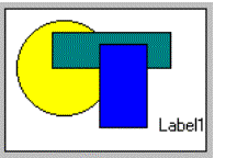
The layout region is a rectangle in which the width is defined by the length of the layout tag, and the height by the next layout tag defined below the current one (or the end of the parent frame). The first character in the layout tag header defines the type of layout tag.
In the following example, the layout region defined by the layout tag named "First" is shown in yellow:
01<G first >02030405<G second >06...
You must place form items by leaving one blank character on the right side, on the left side and at the bottom of the layout region:
01<G first >02Item: [f001 ]03Quantity: [f002 ]04Date: [f003 ]0506<G Second >07...
You can place several layout tags on the same layout line in order to split the frame horizontally. The following example defines four layout regions as group boxes:
01<G first ><G second ><G fourth >02FName: [f001 ] Phone: [f004 ] [f012 ]03LName: [f002 ] EMail: [f005 ]0405<G third >06[f010 ]07
The following example shows multiple usage of layout tags:
01LAYOUT02GRID03{04<S scrollgrid1 ><G g1 >05Ident: [f001 ] [f002 ] [text1 ]06[f003 ] [ ]07Ident: [f001 ] [f002 ] [ ]08[f003 ] [ ]09Ident: [f001 ] [f002 ] [ ]10[f003 ] [ ]1112<G g2 >13[text2 ]14[ ]15[ ]1617<T t1 >18Num Name State Value19[col1 |col2 |col3 |col4 ]20[col1 |col2 |col3 |col4 ]21[col1 |col2 |col3 |col4 ]22[col1 |col2 |col3 |col4 ]2324}25END26END27ATTRIBUTES28GROUP g1:group1, TEXT="Comment";29GROUP g2: TEXT="Description";30TABLE t1:table1, UNSORTABLECOLUMNS;31...
01LAYOUT ( TEXT = "Customer orders" )02VBOX03GROUP group1 ( TEXT = "Customer" )04GRID05{06<G Name >07[f001 ]0809<G Identifiers ><G Contact >10FCode: [f002 ] Phone: [f004 ]11LNumb: [f003 ] EMail: [f005 ]1213}14END15END16TABLE17{18OrdNo Date Ship date Weight19[c01 |c02 |c03 |c04 ]20[c01 |c02 |c03 |c04 ]21[c01 |c02 |c03 |c04 ]22[c01 |c02 |c03 |c04 ]23}24END25FOLDER26PAGE pg1 ( TEXT = "Address" )27GRID28{29Address: [f011 ]30State: [f012 ]31Zip Code: [f013 ]32}33END34END35PAGE pg2 ( TEXT = "Comments" )36GRID37{38[f021 ]39[ ]40[ ]41[ ]42}43END44END45END46END47END
The TABLES section lists every table or view that is referenced elsewhere in the form specification file, in the ATTRIBUTES section for example.
TABLES

 [ alias =
 [database[@dbserver]:][owner.]
] table [,...]

 [END]
01SCHEMA stores02LAYOUT03{04...05}06END07TABLES08customer,09orders10END11...
The ATTRIBUTES section describes properties of the elements used in the form.
ATTRIBUTES

{ form-field-definition | form-item-definition }

[...]

 [END]
where form-field-definition is:
[item-type] item-tag   =  field-name
 [ , attribute-list ]
 ;
where form-item-definition is:
[item-type] item-tag : item-name [ , attribute-list ]
 ;
A form item definition is associated by name to an Item Tag or Layout Tag defined in the LAYOUT section.
In order to define a Form Field, the form item definition must use the equal sign notation to associate a screen record field to the form item. If the form item is not associated to a screen record field (for example, a push button), you must use the colon notation.
Form item definitions can optionally include an attribute-list to specify the appearance and behavior of the item. For example, you can define acceptable input values, on-screen comments, and default values for fields.
When no screen record is defined in the INSTRUCTION section, a default screen record is built for each set of form items declared with the same table name.The order in which you list the form items determines the order of fields in the default screen records that the form compiler creates for each table.
The item-type defines the kind of the form item, to indicate which graphical object must be used to display the form element. The following table describes the supported form item types:
| Form Item Type | Description |
| BUTTON | Defines a standard push button with a label or a picture. |
| BUTTONEDIT | Defines a line edit box with a button on the right side. |
| CANVAS | Defines an area reserved for drawing. |
| CHECKBOX | Defines a boolean entry with a box and a text label. |
| COMBOBOX | Defines a text edit box with a button that opens a list of values. |
| DATEEDIT | Defines a line edit box with a button that opens a calendar window. |
| EDIT | Defines a simple line edit box for data input or display. |
| GROUP | Defines the attributes of a GROUP container specified with a layout tag. |
| IMAGE | Defines an area where a picture file can be displayed. |
| LABEL | Defines an area reserved to display a value. |
| PROGRESSBAR | Defines a progress bar widget to display an integer value. |
| RADIOGROUP | Defines a field presented with a set of radio buttons. |
| SCROLLGRID | Defines the attributes of a SCROLLGRID container specified with a layout tag. |
| TABLE | Defines the attributes of a TABLE container specified with a layout tag. |
| TEXTEDIT | Defines a multi-line edit box for data input or display. |
01ATTRIBUTES02EDIT f001 = player.name, REQUIRED, COMMENT="Enter player's name";03EDIT f002 = player.ident, NOENTRY;04COMBOBOX f003 = player.level, NOT NULL, ITEMS=((1,"Beginner"),(2,"Normal"),(3,"Expert"));05CHECKBOX f004 = FORMONLY.winner, VALUECHECKED=1, VALUEUNCHECKED=0, TEXT="Winner";06BUTTON b1 : print, TEXT="Print Report";07GROUP g1 : print, TEXT="Description";08END
The field-name as used in the ATTRIBUTES syntax, associates the form item to a screen record field, to define a Form Field.
A field definition can reference a database column defined in the database schema files:
[table.]column
or, it can be defined as a FORMONLY field. The data type of the field is defined with an indirect reference to a database column or with an explicit data type:
FORMONLY.field [ TYPE { LIKE [table.]column
| datatype [NOT NULL] }  ]
01ATTRIBUTES02EDIT f001 = player.name, REQUIRED, COMMENT="Enter player's name";03END
The attribute-list as used in the ATTRIBUTES syntax describes how the runtime system should display and handle a Form Item.
attribute [ = { value | value-list
} ] [,...]
where value-list is:
( { value | value-list } [,...]
)
The attribute list can by used, for example, to supply a default value, limit the values that can be entered, or set the text and color of the form item.
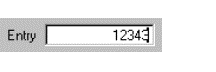
The EDIT form item type defines a simple line-edit field.
EDIT item-tag = field-name [ , attribute-list ]
;
AUTONEXT, CENTURY, COLOR, COLOR WHERE, COMMENT, DEFAULT, DISPLAY LIKE, DOWNSHIFT, HIDDEN, FORMAT, FONTPITCH, INCLUDE, INVISIBLE, JUSTIFY, KEY, NOT NULL, NOENTRY, PICTURE, PROGRAM, REQUIRED, SAMPLE, STYLE, SCROLL, SIZEPOLICY, TAG, TABINDEX, TITLE, UPSHIFT, VALIDATE LIKE, VERIFY.
Table Column only: UNSORTABLE, UNSIZABLE, UNHIDABLE, UNMOVABLE.
01 EDIT f001 = customer.state, REQUIRED, INCLUDE=(0,1,2);Defines a simple line edit box for data input or display.
See also Form Field.
The BUTTONEDIT form item type defines a line-edit with a push-button that can trigger an action.
BUTTONEDIT item-tag = field-name [ , attribute-list ] ;
ACTION, AUTONEXT, CENTURY, COLOR, COLOR WHERE, COMMENT, DEFAULT, DISPLAY LIKE, DOWNSHIFT, HIDDEN, FORMAT, FONTPITCH, IMAGE, INCLUDE, INVISIBLE, JUSTIFY, KEY, NOT NULL, NOENTRY, PICTURE, SAMPLE, SCROLL, SIZEPOLICY, STYLE, REQUIRED, TAG, TABINDEX, TITLE, UPSHIFT, VALIDATE LIKE, VERIFY.
Table Column only: UNSORTABLE, UNSIZABLE, UNHIDABLE, UNMOVABLE.
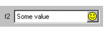
01 BUTTONEDIT f001 = customer.state, REQUIRED, IMAGE="smiley", ACTION=zoom;The BUTTONEDIT form item defines a line edit box with a button on the right side.
This kind of form item is typically used to open a new window for data selection.
The ACTION attribute defines the name of the action to be sent to the program when the user clicks on the button. The IMAGE attribute defines the picture to be displayed in the button.
When you use an HBox tag combined with the SAMPLE attribute, it is possible to specify the exact width of a BUTTONEDIT.
By default, the real width of BUTTONEDIT, DATEEDIT and COMBOBOX is computed as follows (nbchars represents the number of characters used in the form layout to define the width of the item):
If nbchars is greater than 2, width = nbchars - 2; otherwise, width = nbchars.
For example:
01LAYOUT02GRID03{04ButtonEdit A [ba ]05ButtonEdit B [bb: ]06ButtonEdit C [bc : ]07ButtonEdit D [bd -: ]08}09END10END11ATTRIBUTES12BUTTONEDIT ba = FORMONLY.ba, SAMPLE="0", ACTION=zoom1;13BUTTONEDIT bb = FORMONLY.bb, SAMPLE="M", ACTION=zoom2;14BUTTONEDIT bc = FORMONLY.bc, SAMPLE="Pi", ACTION=zoom3;15BUTTONEDIT bd = FORMONLY.bd, SAMPLE="0", ACTION=zoom4;16END
Here the BUTTONEDIT ba occupies 7 grid columns and gets a real width of 5 (7-2). The SAMPLE attribute makes the edit field part as large as 5 characters '0' in the current font. So with this field you can input or display only 5 digits.
The BUTTONEDIT bb, which is in an HBox tag that occupies 7 grid columns, gets a width of 2. Since the SAMPLE attribute is "M", one can input 2 characters as wide as an "M".
The BUTTONEDIT bc, which is in an HBox tag that occupies 7 grid columns, gets a width of 3 (5-2). Since the SAMPLE attribute is "Pi", the edit field part will be as large as the word "Pi". (If SAMPLE contain more than 1 character it must have the same number of characters as in the field definition).
When using an HBox tag, one can specify explicitly the width of the field with the dash size indicator: The BUTTONEDIT bd, which is in an HBox tag that occupies 7 grid columns, gets a width of 4 (because of the dash size indicator). Since the SAMPLE attribute is "0", the edit field part will be as large as 4 digits.
See also Form Field.
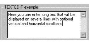
The TEXTEDIT form item type defines a multi line-edit field.
TEXTEDIT item-tag = field-name [ , attribute-list ]
;
COLOR, COMMENT, DEFAULT, DOWNSHIFT, HIDDEN, FONTPITCH, KEY, NOT NULL, NOENTRY, REQUIRED, SCROLLBARS, SIZEPOLICY, STYLE, STRETCH, TAG, TABINDEX, TITLE, UPSHIFT, WANTTABS, WANTNORETURNS.
Table Column only: UNSORTABLE, UNSIZABLE, UNHIDABLE, UNMOVABLE.
01 TEXTEDIT f001 = customer.address, WANTTABS, SCROLLBARS=BOTH;This form field allows the user to enter a long text on multiple lines.
By default, when the focus is in a TEXTEDIT field, the TAB key moves to the next field, while the RETURN key adds a NewLine (ASCII 10) character in the text. To control the user input when the TAB and RETURN keys are pressed, you can specify the WANTTABS and WANTNORETURNS attributes. When you specify WANTTABS, the TAB key is consumed by the TEXTEDIT field, and a TAB character is added to the text. When you specify WANTNORETURNS, the RETURN key is not consumed by the TEXTEDIT field, and the dialog is validated.
You can use the SCROLLBARS attribute to define vertical and/or horizontal scrollbars for the TEXTEDIT form field. By default, this attribute is set to VERTICAL for TEXTEDIT fields.
The STRETCH attribute can be used to force the TEXTEDIT field to stretch when the parent container is resized. Values can be NONE, X, Y or BOTH. By default, this attribute is set to NONE for TEXTEDIT fields.
See also Form Field.
The DATEEDIT form item type defines a line-edit with a button that opens a calendar.
DATEEDIT item-tag = field-name [ , attribute-list ]
;
CENTURY, COLOR, COLOR WHERE, COMMENT, DEFAULT, FONTPITCH, FORMAT, HIDDEN, INCLUDE, JUSTIFY, KEY, NOT NULL, NOENTRY, REQUIRED, SAMPLE, SIZEPOLICY, STYLE, TAG, TABINDEX, TITLE.
Table Column only: UNSORTABLE, UNSIZABLE, UNHIDABLE, UNMOVABLE.
01 DATEEDIT f001 = order.shipdate;This form item type defines a line-edit with a button on the right that opens a calendar, dedicated to DATE input.
When you use an HBox tag combined with the SAMPLE attribute, it is possible to specify the exact width of a DATEEDIT. By default, the real width is computed as width=nbchars-2 when nbchars>2. See BUTTONEDIT for more details.
See also Form Field.
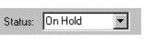
The COMBOBOX form item type defines a line-edit with a drop-down list of values.
COMBOBOX item-tag = field-name [ , attribute-list ]
;
COLOR, COMMENT, DEFAULT, DOWNSHIFT, FONTPITCH, HIDDEN, KEY, INITIALIZER, ITEMS, NOT NULL, NOENTRY, QUERYEDITABLE, REQUIRED, SAMPLE, SIZEPOLICY, STYLE, UPSHIFT, TAG, TABINDEX, TITLE.
Table Column only: UNSORTABLE, UNSIZABLE, UNHIDABLE, UNMOVABLE.
01COMBOBOX f001 = customer.city, ITEMS=((1,"Paris"),(2,"Madrid"),(3,"London"));02COMBOBOX f002 = customer.sector, REQUIRED, ITEMS=("A","B","C");03COMBOBOX f003 = customer.state, NOT NULL, INITIALIZER=myinit;
This form item type defines a line-edit with a button on the right side that opens a drop-down list.
The values of the list are defined by the ITEMS attribute. Real values can be associated to display values, for example:
((1,"Paris"),(2,"Madrid"),(3,"London"))
The INITIALIZER attribute allows you to define an initialization function for the COMBOBOX. This function will be invoked at runtime when the form is loaded, to fill the item list dynamically with database records, for example. It is recommended that you use the TAG attribute, so you can identify in the program the kind of COMBOBOX form item to be initialized.
If neither ITEMS nor INITIALIZER attributes are specified, the form compiler automatically fills the list of items with the values of the INCLUDE attribute when specified. However, the item list will not automatically be populated with include range values (i.e. values defined using the TO keyword). The INCLUDE attribute can be specified directly in the form or indirectly in the schema files.
During an INPUT, a COMBOBOX field value can only be one of the values specified in the ITEMS attribute. During an CONSTRUCT, a COMBOBOX field gets an additional 'empty' item (even if the field is NOT NULL), to let the user clear the search condition.
By default, during a CONSTRUCT, a COMBOBOX is not editable (you are forced to set one of
the values of the list as defined by the ITEMS
attribute, or set the 'empty' item). The QUERYEDITABLE attribute can be
used to force the COMBOBOX to be editable during a CONSTRUCT
instruction. This makes sense if the display values match the real values, in
order to allow the user to enter a search criteria such as "A*".
When you use an HBox tag combined with the SAMPLE attribute, it is possible to specify the exact with of a COMBOBOX. By default, the real width is computed as width=nbchars-2 when nbchars>2. See BUTTONEDIT for more details.
See also Form Field.
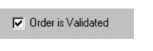
The CHECKBOX form item type defines a boolean checkbox field.
CHECKBOX item-tag = field-name [ , attribute-list ]
;
COMMENT, DEFAULT, FONTPITCH, HIDDEN, KEY, NOT NULL, NOENTRY, REQUIRED, SIZEPOLICY, STYLE, TAG, TABINDEX, TEXT, TITLE, VALUECHECKED, VALUEUNCHECKED.
Table Column only: UNSORTABLE, UNSIZABLE, UNHIDABLE, UNMOVABLE.
01 CHECKBOX f001 = customer.active, REQUIRED, TEXT="Active", VALUECHECKED="Y", VALUEUNCHECKED="N";The CHECKBOX form item type defines a boolean entry with a box and a text label.
The TEXT attribute defines the label to be displayed near the check box.
The box shows a checkmark when the form field contains the value
defined in the VALUECHECKED attribute (for example:
"Y"), and shows no checkmark
if the field value is equal
to the
value defined by the VALUEUNCHECKED
attribute (for example: "N"). If you do not specify the VALUECHECKED or VALUEUNCHECKED
attributes, they respectively default to TRUE (integer 1) and FALSE
(integer 0).
By default, during an INPUT, a CHECKBOX field can have three states:
If the field is declared as NOT NULL, the initial state can be grayed if the default value is NULL; once the user has changed the state of the CHECKBOX field, it switches only between Checked and Unchecked states.
During an CONSTRUCT, a CHECKBOX field always has three possible states (even if the field is NOT NULL), to let the user clear the search condition:
See also Form Field.
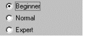
The RADIOGROUP form item type defines a set of radio buttons.
RADIOGROUP item-tag = field-name [ , attribute-list ]
;
COMMENT, DEFAULT, FONTPITCH, HIDDEN, ITEMS, KEY, NOT NULL, NOENTRY, ORIENTATION, REQUIRED, SIZEPOLICY, STYLE, TAG, TABINDEX, TITLE.
Table Column only: UNSORTABLE, UNSIZABLE, UNHIDABLE, UNMOVABLE.
01 RADIOGROUP f001 = player.level, ITEMS=((1,"Beginner"),(2,"Normal"),(3,"Expert"));The text associated with each value will be used as the label of the corresponding radio button, for example:
((1,"Beginner"),(2,"Normal"),(3,"Expert"))
During an INPUT, a RADIOGROUP field value can only be one of the values specified in the ITEMS attribute. During an CONSTRUCT, a RADIOGROUP field gets an additional 'empty' item (even if the field is NOT NULL), to let the user clear the search condition.
Use the ORIENTATION attribute to define if the radio group must be displayed vertically or horizontally.
See also Form Field.
The LABEL form item type defines a simple text area to display a read-only value.

LABEL item-tag = field-name [ , attribute-list ]
;
LABEL item-tag : item-name [ , attribute-list ]
;
COLOR, HIDDEN, FONTPITCH, JUSTIFY, SIZEPOLICY, STYLE, TAG, TITLE.
Form Field Label only: COLOR WHERE, FORMAT, SAMPLE.
Table Column only: UNSORTABLE, UNSIZABLE, UNHIDABLE, UNMOVABLE.
Static Label only: TEXT.
01LABEL f001 = vehicle.description; -- This is a form field label02LABEL lab1 : label1, TEXT="Hello"; -- This is a static label
This form item type can be used to define a read-only text area as a form field or as a static label.
Form Field Label
This type of label item must be used to display values that change often during program execution, like database information. The text of the label is defined by the value of the corresponding form field. The text can be changed from the BDL program by using the DISPLAY TO instruction to set the value of the field, or within a list by using a DISPLAY ARRAY. This kind of form item does not allow data entry; it is only used to display values.
See also Form Field for more details.
Static Label
This type of label item must be used to display text that does not change often, like field descriptions. The text of the label is defined by the TEXT attribute; the item is not a form field. The text can be changed from the BDL program by using the API provided to manipulate the user interface (see Dynamic User Interface for more details). It is not possible to change the text with a DISPLAY TO instruction. This kind of item is not affected by instructions such as CLEAR FORM. Static labels display only character text values, and therefore do not follow any justification rule as in form field labels.
The IMAGE form item type defines an area that can display an image from a pixel-map file.
IMAGE item-tag = field-name [ , attribute-list ]
;
IMAGE item-tag : item-name [ , attribute-list ]
;
AUTOSCALE, HIDDEN, PIXELWIDTH, PIXELHEIGHT, SIZEPOLICY, STYLE, STRETCH, TAG, TITLE.
Table Column only: UNSORTABLE, UNSIZABLE, UNHIDABLE, UNMOVABLE.
Static Image only: IMAGE
01IMAGE f001 = cars.picture, PIXELHEIGHT=300, PIXELWIDTH=400, STRETCH=BOTH;02IMAGE img1 : logo, IMAGE="fourjs.gif", STRETCH=BOTH;
This form item type defines an area where a picture file can be displayed, as a form field or as a static image.
The default picture size is defined by the placement of the item-tag inside the layout, but you can overwrite the default size by using the PIXELWIDTH and PIXELHEIGHT attributes. If these are not used, the size of the image defaults to the relative width and height defined by the item-tag in the form layout section.
The STRETCH attribute can be used to define how the image size must change when the parent container is resized. Values can be NONE, X, Y or BOTH. Default value is NONE for IMAGE fields.
The AUTOSCALE boolean attribute can be set to indicate if the image must be scaled to the available space defined by the width and height of the form item.
The SIZEPOLICY attribute can be used to define if the size of the container must fit the size of the image displayed. When SIZEPOLICY is set to FIXED or INITIAL, the size of the container is defined by the item-tag size in the LAYOUT section and by PIXELHEIGHT and PIXELWIDTH attributes. When SIZEPOLICY is set to DYNAMIC, the size of the container will be the size of the image displayed.
Form Field Image
This type of image item must be used to display values that change often during program execution, like database information. The picture is defined in a file specified with an URL (Uniform Resource Locator) as the value of the corresponding field. The picture can be changed from the BDL program by using the DISPLAY TO instruction to set the value of the field.
See also Form Field.
Static Image
This type of image item must be used to display text that does not change often, such as background pictures or logos. The source file of the image is defined by the IMAGE attribute; the item is not a form field. The image file can be changed from the BDL program by using the API provided to manipulate the user interface (see Dynamic User Interface for more details). It is not possible to change the image with a DISPLAY TO instruction. This kind of item is not affected by instructions such as CLEAR FORM.
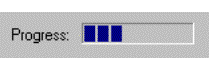
The PROGRESSBAR form item type defines a horizontal bar with a progress indicator.
PROGRESSBAR item-tag = field-name [ , attribute-list ]
;
HIDDEN, VALUEMIN, VALUEMAX, STYLE, TAG, TITLE.
Table Column only: UNSORTABLE, UNSIZABLE, UNHIDABLE, UNMOVABLE.
01 PROGRESSBAR f001 = workstate.position, VALUEMIN=-100, VALUEMAX=+100;This form item type can be used to show progress information.
The position of the progress bar is defined by the value of the corresponding form field. The value can be changed from the BDL program by using the DISPLAY TO instruction to set the value of the field. This kind of form item does not allow data entry; it is only used to display integer values.
The VALUEMIN and VALUEMAX attributes define respectively the lower and upper integer limit of the progress information. Any value outside this range will not be displayed.
See also Form Field.
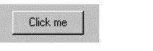
The BUTTON form item type defines a push-button that can trigger an action.
BUTTON item-tag : item-name [  , attribute-list ]
;
COMMENT, HIDDEN, IMAGE, SIZEPOLICY, STYLE, TAG, TEXT.
01 BUTTON btn1 : print, TEXT="Print Report", IMAGE="printer";This form item type defines a standard push button with a label or a picture.
In the BUTTON form item, the label is defined with the TEXT attribute, the picture is defined by the IMAGE attribute, and the COMMENT attribute can be used to define a help bubble for the button.
The CANVAS form item type defines an area in which you can draw shapes.
CANVAS item-tag : item-name
 [  , attribute-list ] ;
01 CANVAS cvs1 : canvas1;See Canvas for more details.
The GROUP form item type defines attributes for a groupbox layout tag.
GROUP layout-tag : item-name
 [  , attribute-list ] ;
FONTPITCH, HIDDEN, STYLE, TAG, TEXT, GRIDCHILDRENINPARENT.
01 GROUP g1 : group1, TEXT="Description", GRIDCHILDRENINPARENT;Use this item type to specify the attributes of a GROUP container defined with a layout tag.
The SCROLLGRID form item type defines attributes for a scrollgrid layout tag.
SCROLLGRID layout-tag : item-name
 [  , attribute-list ] ;
FONTPITCH, HIDDEN, STYLE, TAG, GRIDCHILDRENINPARENT.
01 SCROLLGRID sg1 : scrollgrid1, GRIDCHILDRENINPARENT;Use this item type to specify the attributes of a SCROLLGRID container defined with a layout tag.
The TABLE form item type defines attributes for a table layout tag.
TABLE layout-tag : item-name
 [  , attribute-list ] ;
FONTPITCH, HIDDEN, STYLE, TAG, UNHIDABLECOLUMNS, UNMOVABLECOLUMNS, UNSIZABLECOLUMNS, UNSORTABLECOLUMNS, WANTFIXEDPAGESIZE, WIDTH, HEIGHT.
01 TABLE t1 : table1, UNSORTABLECOLUMNS;Use this item type to specify the attributes of a TABLE defined with a layout tag.
The INSTRUCTIONS section can specify screen arrays, non-default screen records and field delimiters.
INSTRUCTIONS

{ screen-record | screen-array
} [;]

[...]

[ delimiters [;] ]

[ DEFAULT SAMPLE = "string" ]

[END]
where screen-record is:
SCREEN RECORD record-name ( field-list )
where screen-array is:
SCREEN RECORD array-name [ size ] ( field-list
)
where field-list is:
{ table.* | field [ {THROUGH|THRU}
lastfield ] [,...] }
and where delimiters is:
DELIMITERS "AB" Console
Only!
01...02INSTRUCTIONS03SCREEN RECORD s_items[10] =04( stock.*,05items.quantity,06FORMONLY.total_price )07DELIMITERS "[]"08END
The DEFAULT SAMPLE directive defines the default sample text for all fields. See the SAMPLE attribute for more details:
01 DEFAULT SAMPLE = "MMM"A screen record is a group of fields that screen interaction statements of the program can reference as a single object. By establishing a correspondence between a set of screen fields (the screen record) and a set of program variables (typically a program record), you can pass values between the program and the fields of the screen record. In many applications, it is convenient to define a screen record that corresponds to a row of a database table.
The form compiler builds default screen records that consist of all the screen fields linked to the same database table within a given form. A default record is automatically created for each table that is used to reference a field in the ATTRIBUTES section. The components of the default record correspond to the set of display fields that are linked to columns in that table. The name of the default screen record is the table name (or the alias, if you have declared an alias for that table in the TABLES section). For example, all the fields linked to columns of the customer table constitute a default screen record whose name is customer. If a form includes one or more FORMONLY fields, those fields constitute a default screen record called formonly.
Like the name of a screen field, the identifier of a screen record must be unique within the form, and it has a scope that is restricted to when its form is open. Statements can reference record only when the screen form that includes it is being displayed. The form compiler returns an error if record is the same as the name or alias of a table in the TABLES section.
In the INSTRUCTIONS section of a form specification file, you can declare explicit screen records by using the SCREEN RECORD keywords to declare a name for the screen record and to specify a list of fields that are members of the screen record.
A screen array is usually a repetitive array of fields in the screen layout, each containing identical groups of screen fields. Each row of a screen array is a screen record. Each column of a screen array consists of fields with the same field tag in the LAYOUT section of the form specification file.
You must declare screen arrays in the INSTRUCTIONS section with the SCREEN RECORD keyword, as in the declaration of a screen record, but with an additional parameter to specify the number of screen records in the array.
The size value should be the number of lines in the logical form where the set of fields that comprise each screen record is repeated within the screen array. For example, a GRID container of the LAYOUT section might represent a screen array like this:
01...02LAYOUT03GRID04{05OrdId Date Total Price06[f001 |f002 |f003 ]07[f001 |f002 |f003 ]08[f001 |f002 |f003 ]09[f001 |f002 |f003 ]10}11END12END13...
This example requires a size of [4]. Except for the size parameter, syntax for specifying the identifier and the field names of a screen array is the same as for a simple screen record.
You can reference the names of the screen array in the DISPLAY TO, DISPLAY ARRAY, INPUT and INPUT ARRAY statements of programs, but only when the screen form that includes the screen array is the current form.
Screen records and screen arrays can display program records. If the fields in the screen record have the same sequence of data types as the columns in a database table, you can use the screen record to simplify operations that pass values between program variables and rows of the database.
You can change the delimiters used for fields from brackets ( [ ] ) to any other printable character, including blank spaces. The DELIMITERS instruction tells the form compiler what symbols to use as field delimiters when the runtime system displays the form on the screen. The opening and closing delimiter marks must be enclosed within quotation marks ( " ).
To use only one space between fields, in the LAYOUT section, substitute a pipe symbol ( | ) for paired back-to- back ( ][ ) brackets that separate adjacent fields. In the INSTRUCTIONS section, define some symbol as both the beginning and the ending delimiter. For example, you could specify "| |" or "/ /" or ": :" or " " (blanks).
Field delimiters are not displayed when using a graphical front end, but they must be used to delimit the fields in the form specification file.
The KEYS section can be used to define default key labels for the current form.
KEYS

key-name = "label"

[...]

[END]
01...02KEYS03F10 = "City list"04F11 = "State list"05F15 = "Validate"06END
For more details, see "Setting Key Labels".
This section describes the syntax supported for Boolean expressions in form specification files, as in the COLOR WHERE attribute specification, for example.
[(] boolexpr {AND|OR} boolexpr
[)] [...]
where boolexpr is:
[NOT]

{ expression

    {   =

    |   <>

    |   <=

    |   >=

    |   <

    |   >

    |   !=

    |   IS [NOT] NULL

    |   [NOT] BETWEEN expression
AND expression

    }

| charexpr

    {   [NOT]  MATCHES "string"

    |   [NOT]  LIKE "string"

    }

}
In order for your program to work with a screen form, you must create a form specification file that conforms to the syntax described earlier in this section, and then compile the form. You must use the form compiler to do the compilation. Form compilation requires that the database schema files already exist if the form specification file uses a SCHEMA specification.
To work with a screen form, the application requires a form driver, which is a logical set of interactive statements that control the display of the form, bind form fields to program variables, and respond to actions by the user in fields.
Compiled forms must be loaded by the program with the OPEN FORM or the OPEN WINDOW WITH FORM instruction.
Once the form is loaded, the program can manipulate forms to display or let the user edit data, with instructions like DISPLAY TO, INPUT, INPUT ARRAY, DISPLAY ARRAY and CONSTRUCT. Program variables are used as display and/or input buffers.